
Written by the EasyDone team. Last checked 10 October 2026.
They can if five things work: they can read it with the text turned up, tap the right thing the first time, type without the keyboard hiding the box, fix a mistake without starting again, and know what happens after they press send. You can test all five in ten minutes with a stopwatch, a phone and someone who isn't you.
Most of the fixes take ten minutes too. Here's the test, what it found on a real-feeling website, and how to sort each problem before smoko.
Why this matters more than you'd think
Two numbers. In 2022, 21.4% of Australians had disability, and 17.1% were aged 65 and over.1 That's a big slice of your customers who might be reading your website with the text enlarged, a slight tremor in their thumb, or glasses they left in the car.
And there's a rule behind it. The Australian Human Rights Commission's advisory notes on web access say that information and services provided online are covered by the Disability Discrimination Act.2 Making your enquiry form usable for everyone isn't just good manners. It's part of serving the public.
The good news: the things that help someone with low vision are exactly the things that help a bloke in the sun with dirty hands. Fix it for one and you've fixed it for everyone.
Meet the shop
Gary Reid runs Reid Mower & Saw in Bunbury. Ride-ons, push mowers, whipper snippers, the odd chainsaw that's been in a shed since 2009. His customers skew older: retirees in Australind, Eaton and Dalyellup who want their mower serviced before the grass takes off in spring.
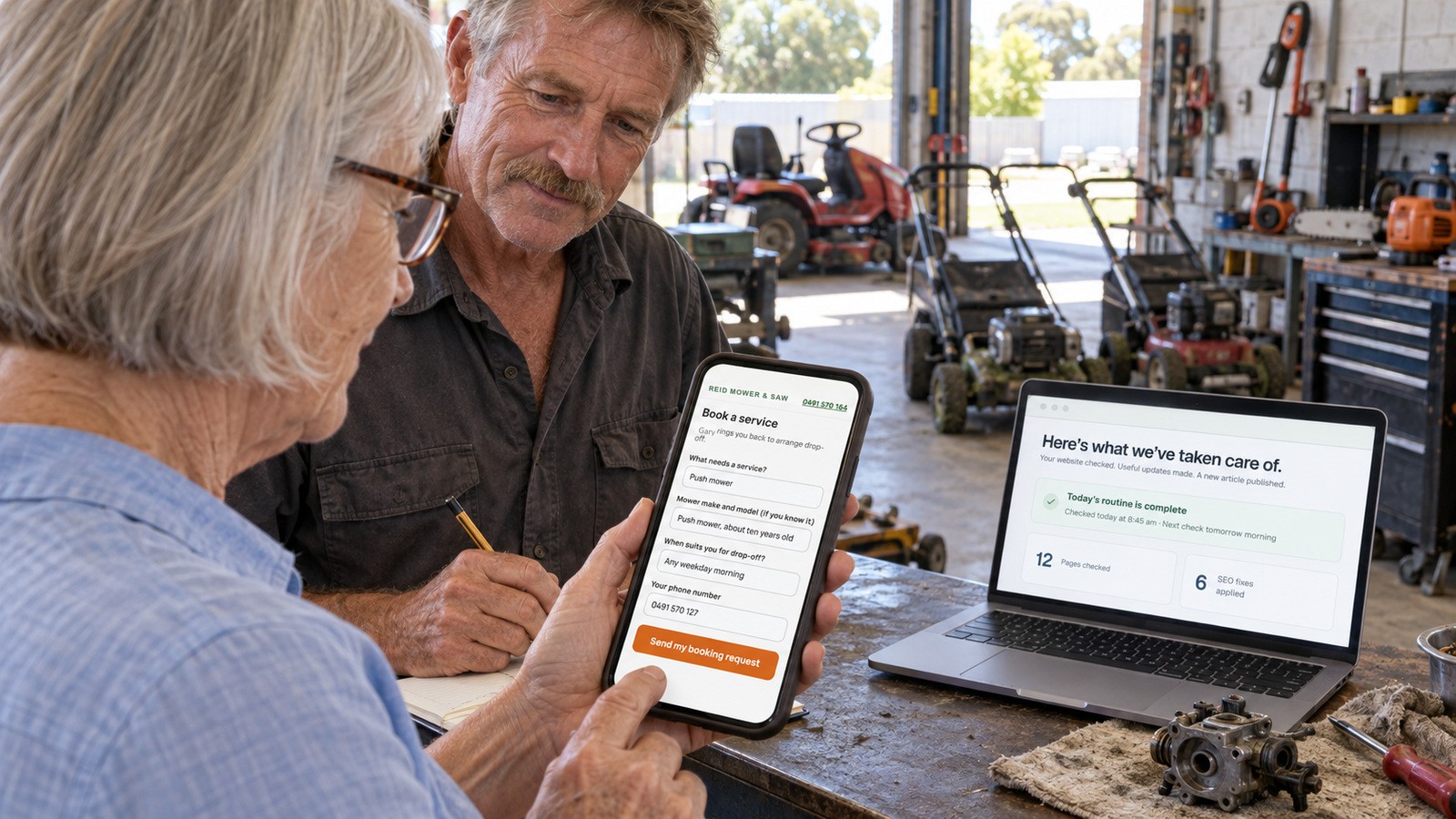
His website had a "Book a service" form. Hardly anyone used it. They rang instead, usually while Gary had a carby in pieces on the bench. So one quiet Tuesday, Gary asked a regular, a lovely woman from Eaton, to book a service on his website using her own phone while he stood beside her with a notepad and kept his mouth shut. That last part was the hardest.
The 10-minute test
Use a real phone, on mobile data, and a tester who's never used your site. Give them one job: "Book a service for your mower." Then watch, time it, and write down every pause.
| Minute | What they try | What you're checking |
|---|---|---|
| 0 to 2 | Find the service and whether you'll do it | Can they find it without help? |
| 2 to 4 | Turn the text size up in the phone settings, reload | Does the page still read properly? |
| 4 to 6 | Use the menu, tap the main button | Do taps land where they're meant to? |
| 6 to 8 | Fill in the form | Does the keyboard hide anything? |
| 8 to 9 | Send it with a box left empty, then fix it | Does the error help, and did the other answers survive? |
| 9 to 10 | Send it properly, then read the screen | Do they know what happens next? |
Then check your inbox. If the enquiry hasn't arrived, the website failed, no matter how nice it looked.
What Gary's notepad said
Here's what went wrong in ten minutes, in the order it happened:
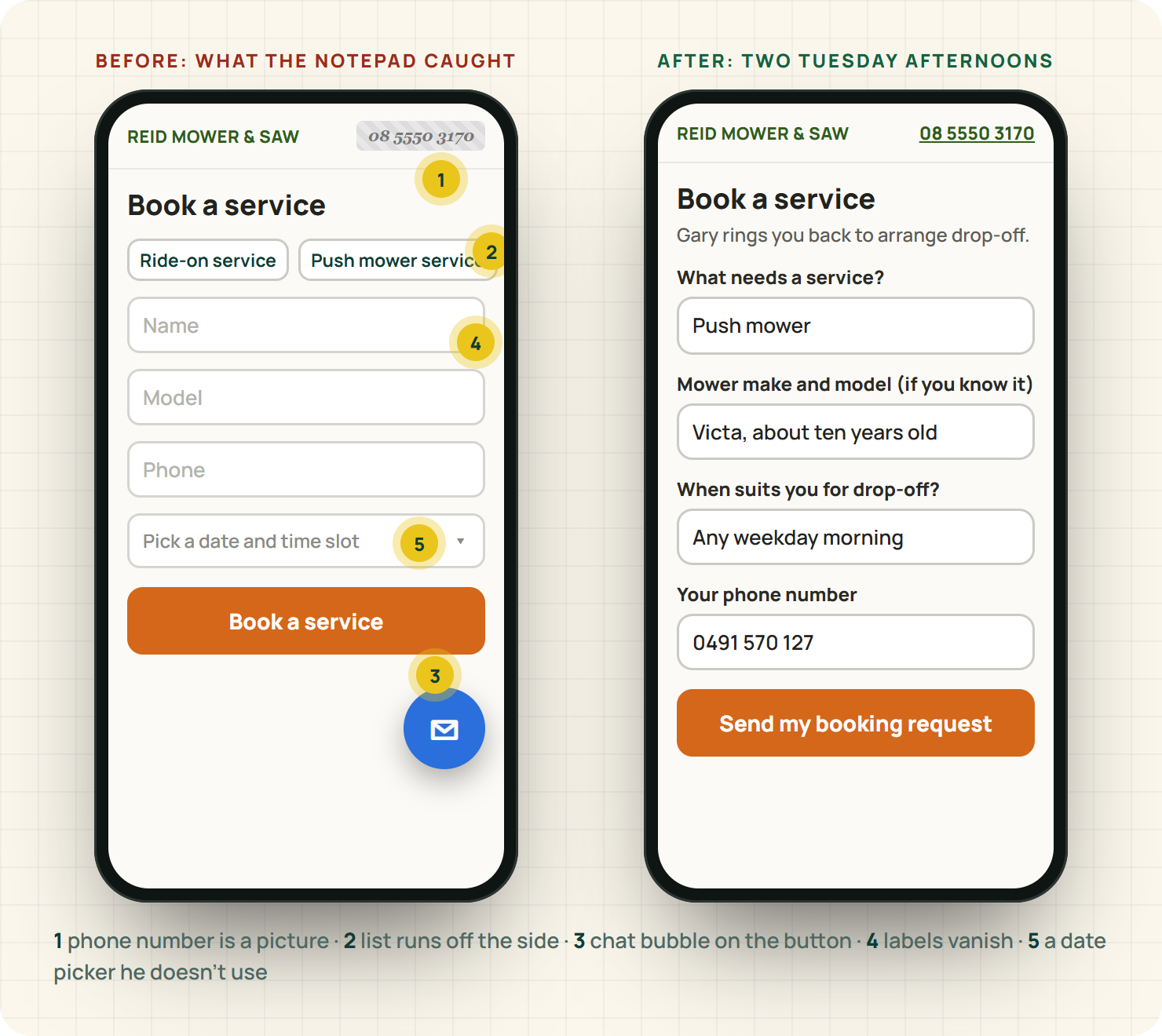
- The phone number at the top was a picture, so tapping it did nothing.
- With the text turned up, the service list ran off the side of the screen and she had to scroll sideways.
- A chat bubble sat right on top of the "Book a service" button. She tapped the chat bubble twice by accident.
- The form's labels were grey text inside the boxes that vanished as soon as she started typing, so she forgot which box wanted the mower model.
- The date picker wanted her to pick a date and a time slot, which Gary doesn't actually book from anyway.
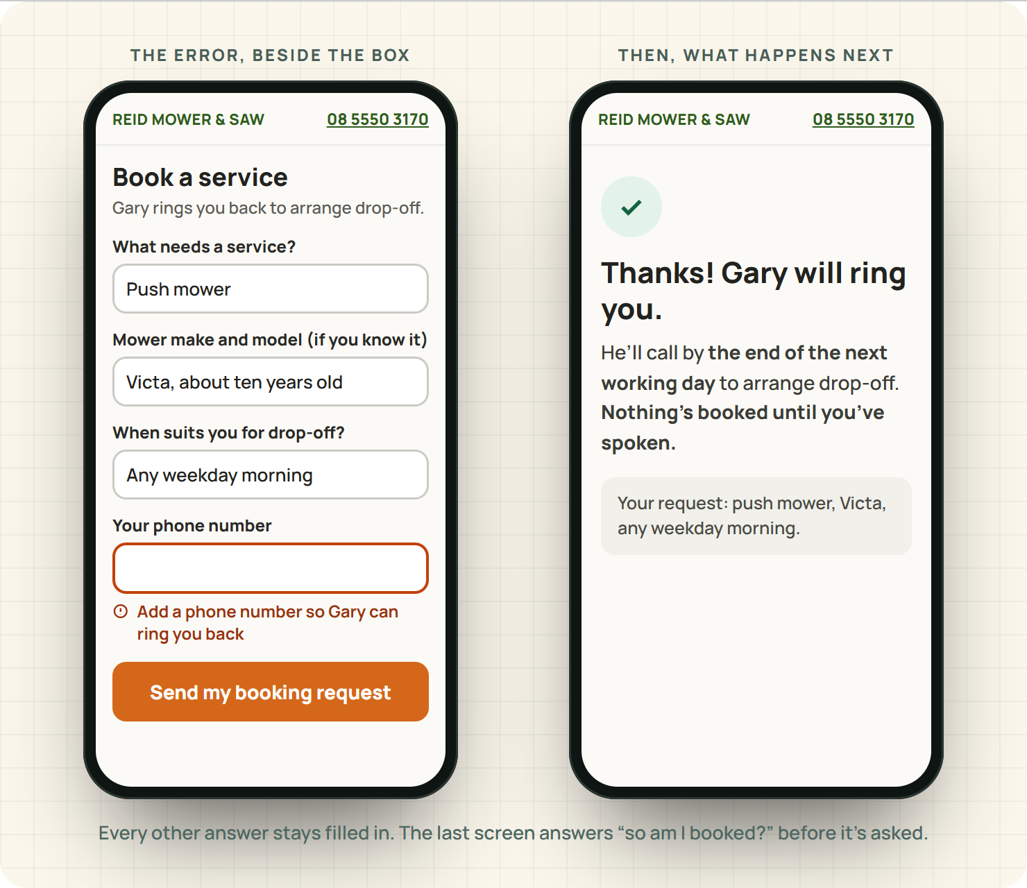
- She left the phone box empty. The error appeared at the very top of the page, out of sight, and cleared her message.
- The final screen said "Submitted." She asked Gary, "So... are you ringing me, or am I booked in?"
Seven problems, none of them technical rocket science. Every one of them had been costing Gary enquiries for years.
The 10-minute fixes
Make the phone number tappable text
A number written as text can be tapped to call on any phone. A number in a picture can't be tapped, enlarged properly or read by a screen reader. Ten minutes, tops.
Let the page reflow when the text gets bigger
W3C's guidance on reflow is that content should still work at narrow widths and when zoomed, without scrolling sideways.3 Usually this means removing a fixed-width table or box that a template squeezed in. Your website person can find it in minutes once you show them the screenshot.
Move anything that sits on top of the main button
Chat bubbles, cookie banners and "Subscribe!" pop-ups love to park on the bottom right of a phone screen, exactly where the main button lives. W3C's design tips call for controls that are easy to identify and use.4 Gary didn't need the chat bubble at all. Nobody wants to chat with a mower shop; they want a service booked.
Put labels above the boxes
W3C's forms guidance says every field needs a clear label.5 A label that sits above the box and stays there beats grey placeholder text every time. "Mower make and model (if you know it)" is a label. A vanishing grey "Model" is a memory test.
Ask the question you actually use
Gary doesn't book from a date picker. He books by ringing people back. So the date picker became one plain box: "When suits you for drop-off?" Fewer taps, and the answer is more useful.
Put the error where the problem is, and keep their words
W3C's guidance on notifications is to say clearly what went wrong, near where it went wrong, and to confirm clearly when it worked.6 "Add a phone number so Gary can ring you back" beside the empty box, with every other answer still filled in.
Say exactly what happens next
The new confirmation says: "Thanks! Gary will ring you by the end of the next working day to arrange drop-off. Nothing's booked until you've spoken." No more guessing.
Write it up so it gets fixed
If someone else looks after your website, hand them the notepad, not a vibe. "Mobile feels clunky" gets you a shrug. This gets you a fix:
- Page: Book a service
- Phone and setting: her own phone, text size turned up
- What she tried: tapping Book a service
- What happened: the chat bubble covered the button and opened instead, twice
- What should happen: the booking form opens
One line per problem, in the order they happened, with a screenshot if you can grab one. Gary's list of seven took him four minutes to write and his web person half a morning to fix.
Two more checks for the same afternoon
Google mostly uses the phone version of your site for indexing,7 so anything you've hidden on mobile to "keep it tidy" is hidden from Google too. Keep your services, area and contact details on the phone version, in full.
And watch the page while it loads. Google's Web Vitals include how much the page jumps around and how fast it responds to a tap.8 If the button moves just as your tester goes to press it, that's a fix for your website person, and a common reason people tap the wrong thing.
Where EasyDone Studio comes in
Studio is ours, so read this part as the sales bit. It's short.
On every Studio plan, you can edit every page, word and photo yourself.9 Most of Gary's fixes were words: the labels, the error message, the confirmation, the phone number as text. On Studio those are your changes to make on a Tuesday afternoon, not a request in someone else's queue.
Growth adds AI help rewriting what's already there,9 which is handy for exactly this job: "make my booking form clearer for older customers" gets you plainer labels and a confirmation that answers the "so am I booked?" question before it's asked.
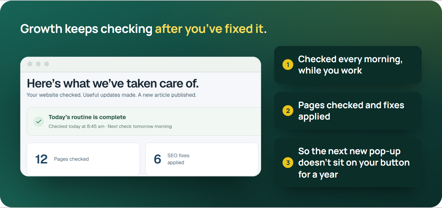
Growth adds ongoing website checks and SEO improvements,9 so the next thing that breaks, like a new pop-up that lands on your button, doesn't sit there for a year.
One honest limit: no software can replace the ten minutes with a real customer and a notepad. Do the test yourself after every change.
The plans, side by side, are on the pricing page.
The verdict
If a stranger can't book on your website with their own phone in ten minutes, your form is costing you work, and the phone keeps ringing while you're at the bench. Nearly every fix in this test is words and settings, not a new website: bigger text that still reads, buttons that land, labels that stay put, an error message that helps, and a confirmation that says what happens next. Fix those, then run the same test again with someone new.
Your turn
Find someone who's never booked with you, hand them their own phone, and say "book a job with us". Stand there with a notepad and say nothing. It's the most useful ten minutes you'll spend on your website this year.
If what you find is mostly about the form itself, the enquiry form guide goes deeper. And if your website needs more than a few fixes, see what EasyDone Studio builds for your business.
Sources
- Australian Bureau of Statistics: Disability, Ageing and Carers, Australia: Summary of Findings, 2022 accessed Saturday 10 October 2026
- Australian Human Rights Commission: World Wide Web Access: Disability Discrimination Act Advisory Notes accessed Saturday 10 October 2026
- w3.org: W3C: Reflow accessed Saturday 10 October 2026
- w3.org: W3C: Designing for accessibility accessed Saturday 10 October 2026
- w3.org: W3C: Accessible forms accessed Saturday 10 October 2026
- w3.org: W3C: Form notifications accessed Saturday 10 October 2026
- developers.google.com: Google: Mobile-first indexing accessed Saturday 10 October 2026
- web.dev: Google web.dev: Web Vitals accessed Saturday 10 October 2026
- Product documentation: EasyDone Studio: Plan inclusions accessed Saturday 10 October 2026
Researched and written with AI for EasyDone Studio. Every figure links to the source it came from.